The Bowes Museum
During the mid-19th Century, John and Josephine Bowes commissioned the building of a museum modelled on a French chateau in the heart of the County Durham countryside. The museum was to house their art collection of over 15,000 pieces. The Bowes’ vision was to share their collection of decorative arts with the local population. Their museum, with its extensive and elegant grounds, took 23 years to build, opening in 1892. In its first year, the museum attracted 63,000 visitors.
Working with:
Client: The Bowes Museum
Interior Design: Williams Design Associates
The project timeline:
2009:
Internal signage
2011:
Decoration and ornament


Best practice guidelines for signage in the historical context of The Bowes Museum allowed for the use of a serif typeface.


What our client said:
“The interpretation panels that Picto have provided for us are stylish and innovative. We know, from visitor research, that the design in order to guide people through four centuries of style in our new gallery, has been successful.”
Jane Whittaker | Head of Collections
The Bowes Museum
In the early 2000s The Bowes Museum underwent significant redevelopment and upgrading. We were appointed to work on two different projects at the museum – the branding and information signage in the museum foyer, and the design and interpretation for a new gallery, ‘English Interiors 1500-1900.’
A stylish aesthetic for a popular visitor destination
The first project, to develop the branding and information signage in the museum foyer, required graphics for the museum reception area, a funder’s board, and toilet signage. The Bowes Museum plays host to a wide range of different exhibitions and events throughout the year, and so an elegant yet flexible system to display the different posters and relevant exhibition information was also needed. We provided flexible signage including free-standing display signs, wall-mounted poster units and countertop signs for displaying information in key points in the area, all in a special bronze finish.
Marrying the contemporary to the historic
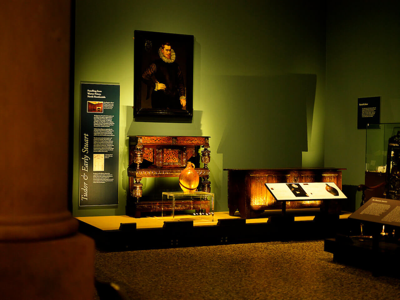
Our second project was the design and interpretation for the new gallery, ‘English Interiors 1500-1900’, which opened in 2010. The gallery covers notable historical periods of interior style, starting with Tudor and Early Stuart, Restoration and Baroque, Palladian, Rococo, Chinoiserie, Neo Classical and Regency, through to the Victorian era. Our first task was to develop a system to display the many images of paintings, illustrations, photographs and copy supplied to us by the museum curators.
Direct to surface print for permanent displays
The gallery setting required a high print quality for the displays, which would become permanent fixtures in the museum. We opted for direct to surface printed graphics onto fabric panels which are held in tension within minimal aluminium frames, in both wall and free standing formats. This introduced both contemporary materials and modern manufacturing processes to the historic setting. The social context information provided by the curators was displayed on rigid panels with a textured laminate surface, flush mounted within bronze-finish lecterns.
Colour definition and the challenge of historical paint matching
Each period in the gallery was allocated a colour, which would achieve sufficient visual contrast for the visitor, whilst coordinating and not competing with the items on display. We blended traditional sign making with the application of direct to surface printing and contemporary substrates, taking particular care when using modern production methods to reproduce and match the historic paint colours.