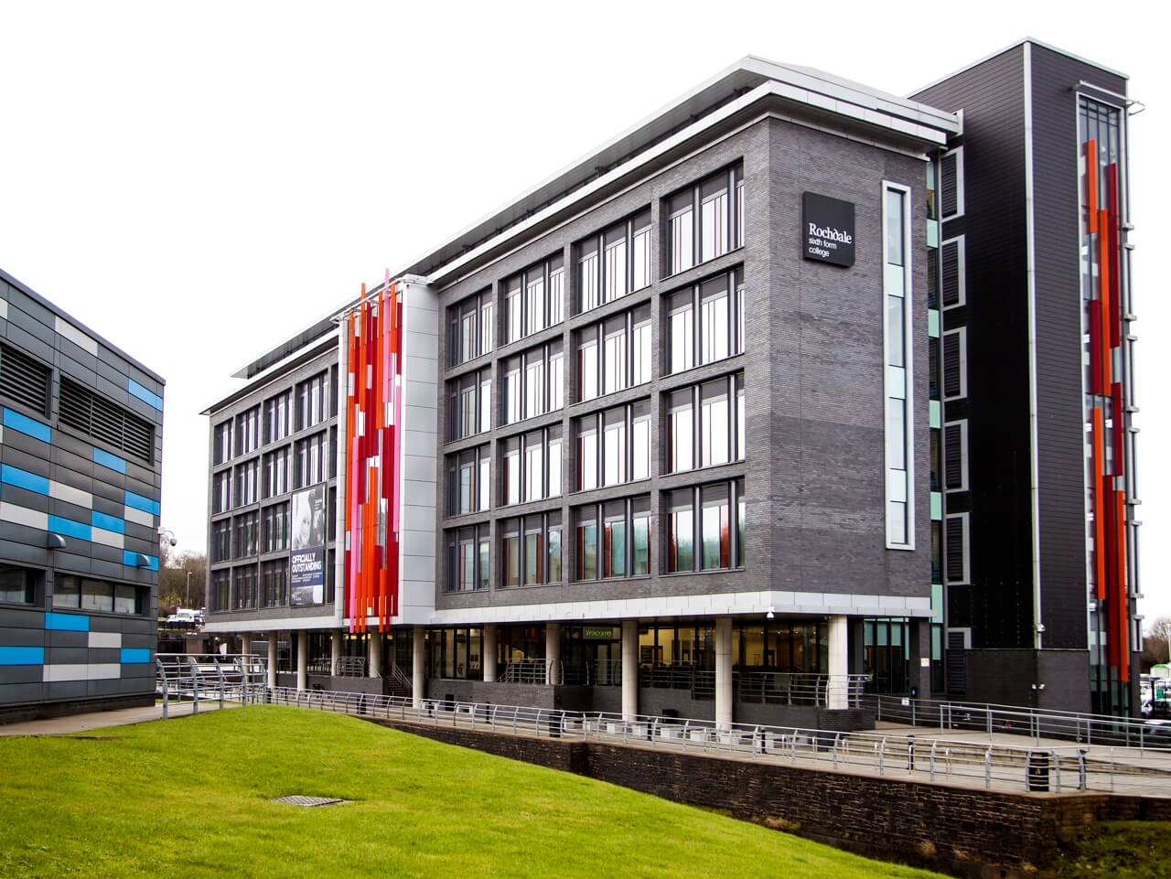
Rochdale Sixth Form College
In September 2010, Rochdale Sixth Form College opened its doors to students for the first time. The new £19 million six-storey build featured a basic monotone signage system. The college’s state of the art facilities include a 160-seat theatre, dance and drama studios and multiple flexible teaching and learning spaces.
Working with:
Client: Rochdale Sixth Form College
Architect: Seven Architecture
The project timeline:
September 2010:
Brand new college opens
February 2017:
Picto appointed to design new interior signage scheme
August 2017:
Manufacture and installation
What Sarah said:
“The site survey and analysis revealed that we could aid people’s navigation, streamline the buildings statutory notices and solve the problem of removing and re-fixing the signage during redecoration.”
Sarah Phillips | Picto
Rochdale Sixth Form College
In February 2017, Picto was appointed to develop a new wayfinding strategy for Rochdale Sixth Form College. There was an emerging need to help students, staff and visitors to find their way around the building with greater ease, coupled with a desire to reflect and represent the excellent quality of education on offer. During a tour of the building it was also clear that the college’s statutory signage would benefit from both rationalisation and simplification.
Adding colour to add positivity and energy
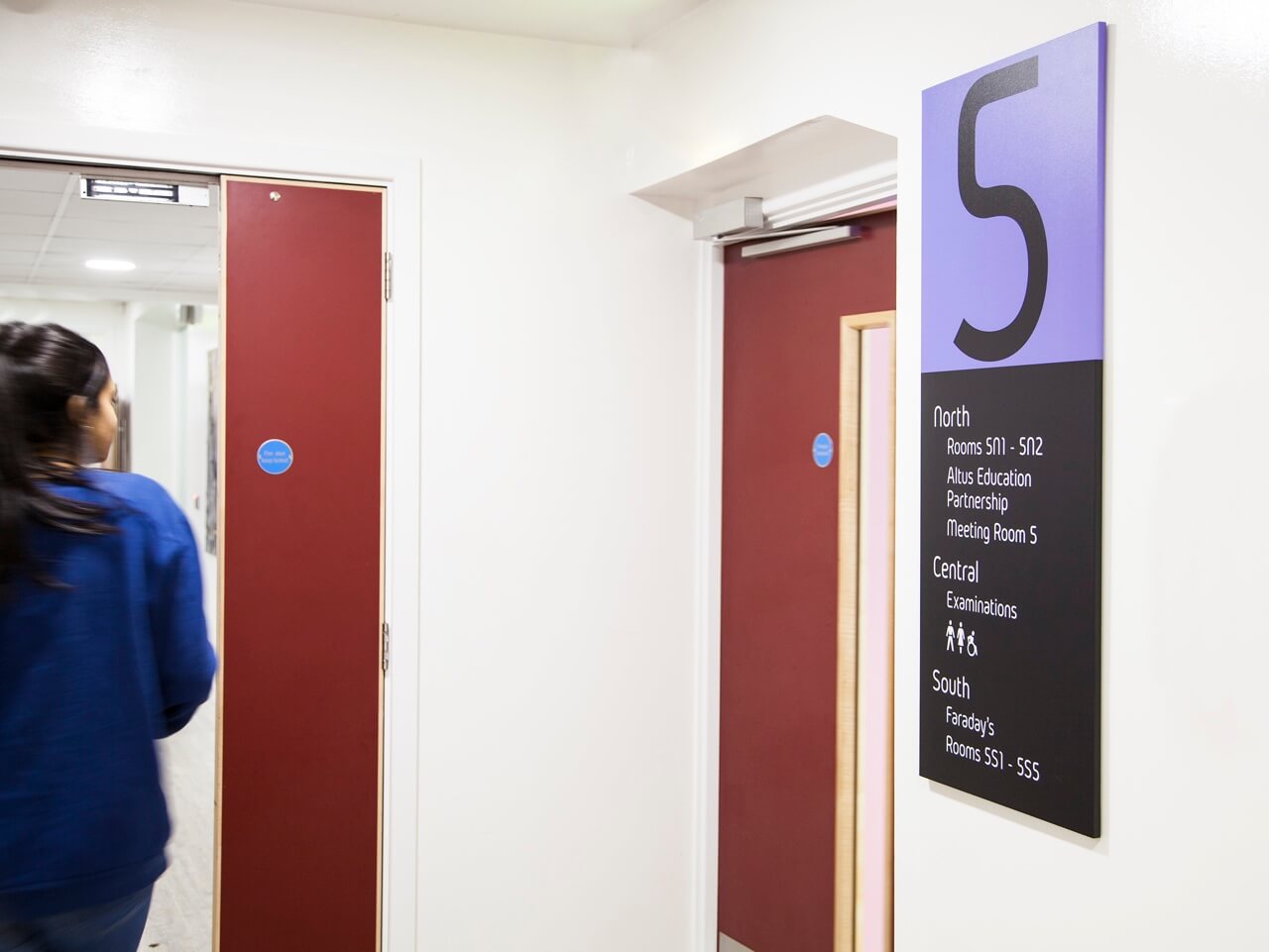
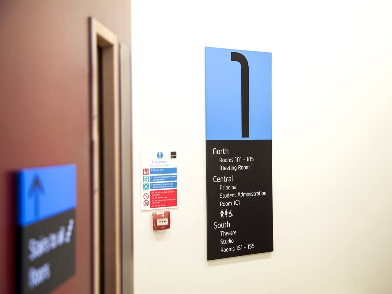
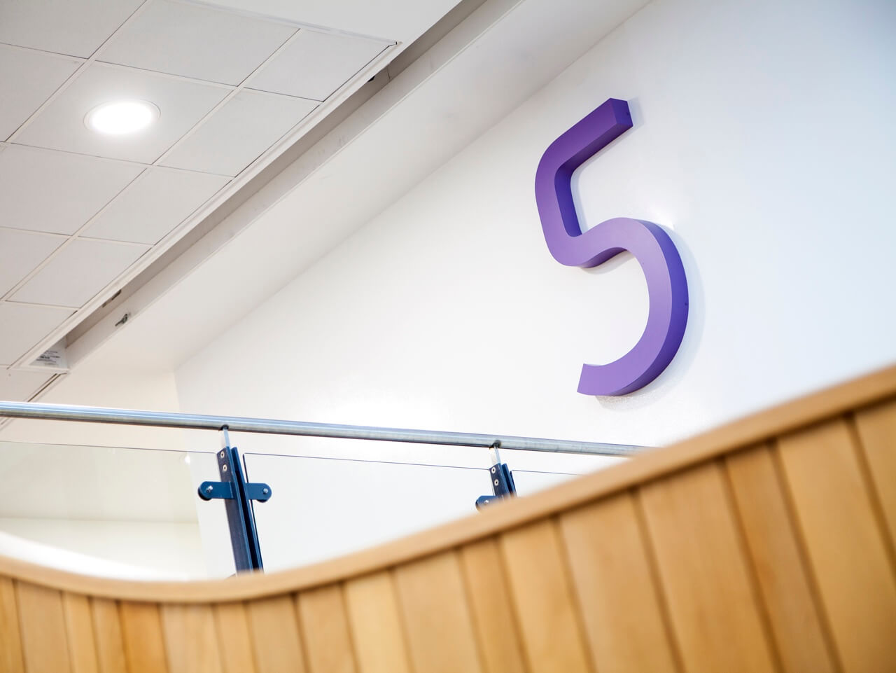
As part of the wayfinding scheme we introduced six bright and decorative colours. We combined these colours with pictograms, a contemporary typeface and a clear, easy to interpret arrow style. These elements gave the signage a positive and dynamic feel, clearly denoting and defining the different floors.
A robust and flexible signage system
The high-achieving college has a fast-changing timetable. We developed a signage system that could be updated with ease, without compromising the quality of the information on display. By defining the north and south sides of the college, we formed a clear basis to number the teaching rooms and developed floor-directories and room signs that could be quickly reprinted to reflect classroom and timetable changes.
