Milecastle Primary School
Newcastle City Council’s ‘Building Schools for the Future’ (BSF) programme saw the major redevelopment of Milecastle Primary School from two existing 1970s school buildings into one. While one of the existing schools on the site, Knop Law Primary School, was relocated, the building for Milecastle Primary School was gutted, reconfigured and refurbished, merging the two older buildings into one cohesive whole.
Working with:
Client: Newcastle City Council
Architect: ADP
Contractor: Sir Robert McAlpine
The project timeline:
June 2011:
Appointed to develop budget and scheme
July 2011:
Developed proposal
August – October 2011:
Design and development
November 2011:
Manufacture
December 2011:
Installation


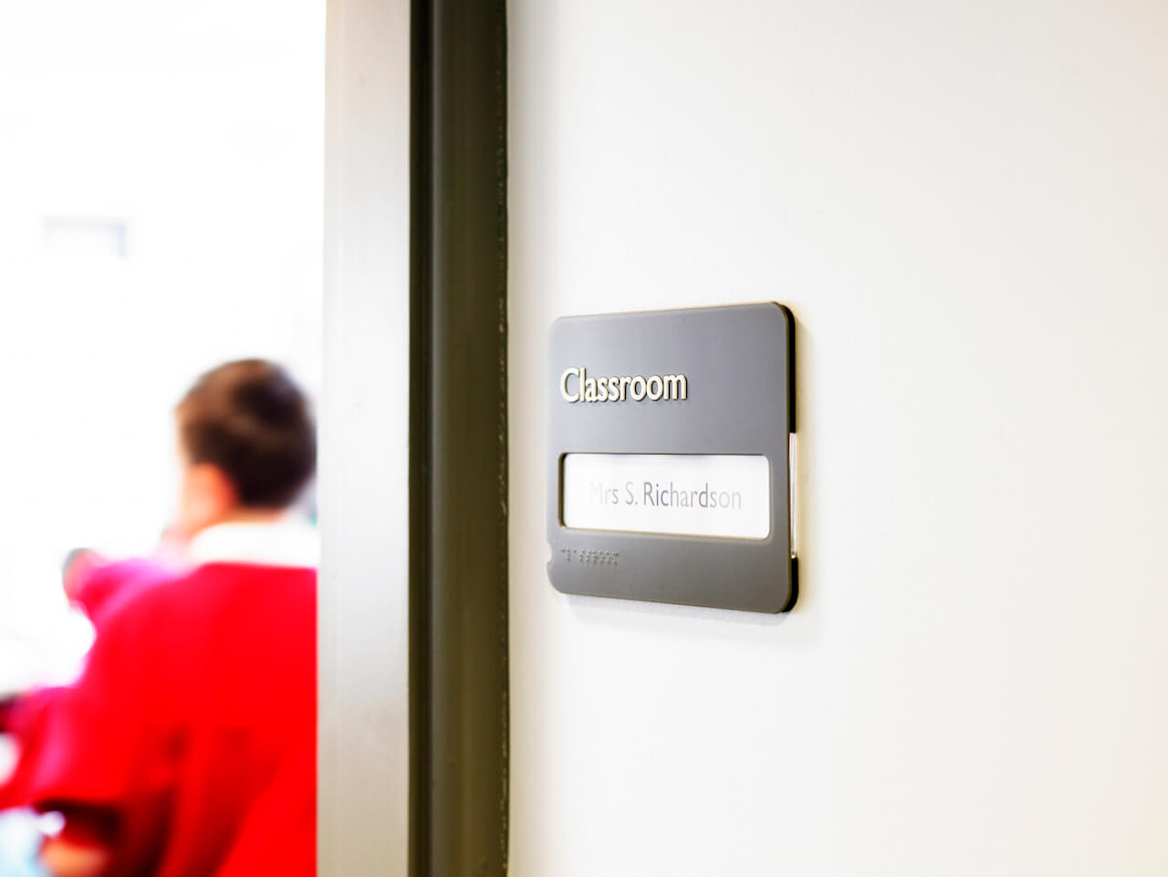
The use of tactile and Braille graphics is not a legal requirement in the UK, but it can benefit pupils with differing levels of partial vision.
Their inclusion also helps educate fully sighted pupils and raises the school’s equality and diversity profile.


What our client said:
“The initial detailed design proposals demonstrated an understanding of the way in which the school operated for staff, children and other users, including those with disabilities… Our requirements were for simple and clear designs, which would be appropriate for the youngest to the oldest children. This was very much achieved with signage and its position consistent through the building and the wider site. It is informative, supports our daily operations and is never obtrusive.”
Lyn Rae | Headteacher
Milecastle Primary School
Working closely with the project architect, ADP, and with input from the headteacher, we developed an internal and external wayfinding scheme that would enrich the newly configured Milecastle Primary School and make it easy for people to navigate their way around. The scheme repeats some of the elements we used at Knop Law Primary School, while giving Milecastle its own distinct identity.
Supergraphics create dynamic points of visual interest
Environmental graphics are a notable feature at Milecastle. Externally we incorporated the school name into a bold 3D facade that uses a palette of six bright colours and carried these colours on into the internal signage scheme.
Internally, a key focus point is the 21-metre-long dynamic raised supergraphic featuring brightly coloured silhouettes of children at play. The graphic runs along one side of the main school corridor.
Pictograms help to keep things simple
Elsewhere, simple language and easily recognisable pictograms help children and adults navigate their way around main areas like the school reception, library, dining room and hall.
The school’s classrooms are identified with tactile and Braille graphics, and each sign also incorporates a printed card insert so that the teaching staff can update their locations with ease.