Spanish City
In 2017, Picto was invited to develop the interior and exterior wayfinding and signage for the Grade II listed Spanish City on the seafront at Whitley Bay in North Tyneside. The project saw us working closely with ADP Architecture within a larger project team, which included Robertson Construction, North Tyneside Council and the venue operators, Kymel. The £9.97 million redevelopment project was supported by North Tyneside Council, the Heritage Lottery Fund and the Coastal Communities Fund.
Art Deco wayfinding
Built in 1910, the high white dome of Spanish City with its verdigris dancing ladies who decorate the pillars aside the roof, is a classic Art Deco building. The challenge for us was to marry signage that would sit sympathetically within the original building and its new modern extension, added as a part of the 2018 renovation, without being a pastiche.
Quality materials reflected throughout
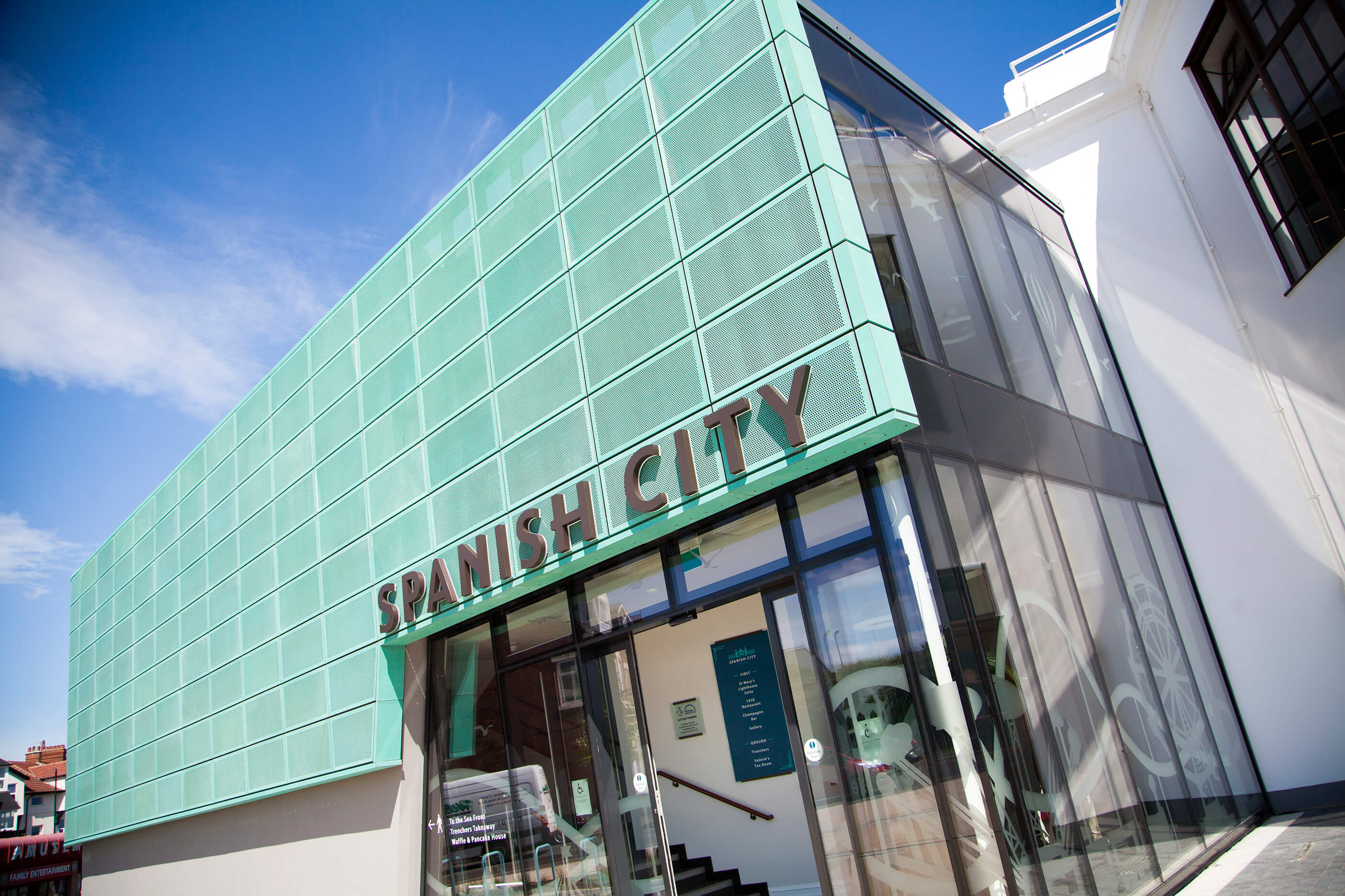
Additional considerations were needed to reflect the high quality of the materials being used throughout architect ADP’s restoration. The restored Spanish City now boasts elegant bronze, glass and walnut finishes and one side of the building is clad in verdigris perforated metal cladding, which echoes the colour of the dancing ladies on its roof.
Versatile signage for added longevity
Like our work at the
Spetchells Centre in Northumberland, one challenge that faced us on this project was that the signage had to both work with the Spanish City brand and alongside a number of tenant sub-brands. To ensure the longevity of our scheme, we worked closely with ADP Architects to ensure that all the signs in the building can be physically updated with ease, should the sub-brands change in the future.
Bringing sub-brands together within a listed space
Working with local illustrator Kerry Jordan, we developed a corner detail, which would tie all the signage within Spanish City together on a graphic and visible level. The design of the marque references the Art Deco architecture in a contemporary way and works with the Spanish City brand, the tenant names when written and the tenant sub-brand logos. It has also been applied to the tenant’s menus.
The challenges of unconventional spaces
The signage scheme at Spanish City needed to work within and across a series of unconventional and quirky spaces. The potential locations for the internal signage changed throughout the building. There were both slight differences to the amount of wall space available and a number of recesses. We have worked to ensure that each sign has been positioned to be visible and legible, even when the building is busy — for example by incorporating tenant signs onto the glass fascia above the entrances along the sea front.
The imagery and language of the coast
The new fully-glazed, full-height entrance to Spanish City required a manifestation to meet building regulations. The entrance faces up into the town of Whitley Bay and marks the spot where, in the past, the Spanish City funfair would have been held. Local people hold fond memories of this fair and its place in people’s memories is still celebrated in photographs and in postcard form in shops and cafés around the town.
We identified that this space held an opportunity to develop something unique and fitting to the building and its heritage as a place of fun, relaxation and holidays. Working again with illustrator Kerry Jordan, team discussions began to centre on the fun fair and we began to develop a series of bespoke environmental graphics for the project.
We experimented with scale, working up from the minimum band required to meet with building regulations, until eventually settling on a dramatic, large format design that is highly visible as you approach the building and which extends to include the glazed wall on the first floor in homage to the original fun fair.
We applied a further, slightly different approach applied in keeping with the style and age of the building when looking at the tone of voice for its signage, with bold and descriptive calls to action that say simply, for example, “To the sea front”.


